

Most people use violet, indigo, and purple like they mean the same thing. They don’t. Mix them up in a design brief, a painting class, or even a casual conversation, and you’ll either get strange looks or the completely wrong color on your wall. The good news? Once you understand what actually separates these three, you’ll never confuse them again. Let’s settle this once and for all.
So What Exactly Are Violet, Indigo, and Purple?
Here is the short answer, right up front:
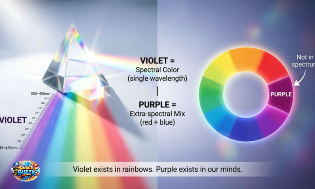
- Violet is a real color of light. It sits at the end of the visible spectrum, with a wavelength of roughly 380 to 450 nanometers. Your eye can see it directly.
- Indigo is also a spectral color, sitting between blue and violet on the rainbow, with a wavelength of around 420 to 450 nanometers. It is dark and blue-heavy.
- Purple is not a spectral color at all. It does not exist in a rainbow. Your brain creates it by mixing red and blue light together.
That one distinction, spectral vs. non-spectral, is the core of this whole conversation. Everything else builds from there.
What Does “Spectral Color” Even Mean?
Think of a rainbow. When sunlight passes through a prism or a raindrop, it splits into a band of colors: red, orange, yellow, green, blue, indigo, and violet. These are called spectral colors because they each correspond to a specific wavelength of light.
Violet and indigo are both spectral colors. They actually exist as single wavelengths of light in the physical world.
Purple, however, is not. You will never find purple in a rainbow, no matter how long you stare at one. Purple only appears when your brain receives signals from both red-sensitive and blue-sensitive cone cells at the same time. It is entirely a perception, a color your mind assembles rather than your eye directly detects.
This is why scientists sometimes call purple a “non-spectral” or “extra-spectral” color. It is real to your eyes but technically does not exist as a single frequency of light. Fascinating and slightly mind-bending at the same time.
How Violet, Indigo, and Purple Look Side by Side
Seeing them together makes the differences obvious:
| Color | Hex Code | Wavelength | Appearance |
| Violet | #7F00FF | ~380–450 nm | Bright, blue-tinged purple; electric and vivid |
| Indigo | #4B0082 | ~420–450 nm | Dark, rich, navy-meets-purple; very deep |
| Purple | #800080 | No wavelength (mixed) | Balanced red and blue; the “classic” purple most people picture |
Notice how indigo is far darker than most people expect. When you point to something “indigo” and it looks like a bright medium purple, you’re almost certainly looking at violet instead.
The Real Difference Between Violet and Purple
This is the one that trips people up the most, and understandably so. They look similar. But here is how to tell them apart instantly.
Violet leans blue. It has very little red in it. Think of the color at the edge of a rainbow just before it disappears. That cool, almost electric hue is violet.
Purple leans red. It is a genuine 50/50 blend of red and blue energy. Think of a royal robe, a grape, or a classic crayon labeled “purple.” That warmer, richer tone is purple.
A simple rule: if the color looks like it could pass for a very deep blue, you are probably looking at violet. If it reads as unmistakably both red and blue, that is purple.
Where Does Indigo Fit In?
Indigo is the quiet middle child that nobody talks about enough. It sits between blue and violet on the spectrum, which means it reads as an extremely dark, blue-dominated color rather than anything resembling typical purple.
The indigo you see on a color wheel or in a designer’s palette is often described as a dark navy with a purple undertone. It is not a bright color. Raw, natural indigo dye, extracted from the Indigofera tinctoria plant, produces a rich, almost midnight blue shade.
Here is something interesting: many color scientists argue that indigo should not even be listed separately in the rainbow. Sir Isaac Newton added it to the spectrum partly to make the colors match the seven notes of the musical scale. Without Newton’s decision, we would likely describe the rainbow as having just six colors. So indigo has been a bit of a controversial guest at the color table for over 300 years.
Historical and Biblical Context: These Colors Carried Real Weight
Colors were not just decorative in the ancient world. They were political, spiritual, and economic statements.
Purple was historically the color of power and royalty. The famous “Tyrian purple” dye was extracted from sea snails called Murex, and it took thousands of snails to produce a single gram of dye. Only emperors, kings, and the highest clergy could afford it. In the Bible, purple garments signal wealth and status throughout both the Old and New Testaments. The book of Proverbs describes the virtuous woman as clothed in purple. In Revelation, Babylon is described as wearing purple and scarlet.
Indigo was a major trade commodity for centuries. India was the world’s primary source of indigo dye, which is why it carried the name “indigo,” derived from the Latin indicum, meaning “from India.” It colored the robes of priests and the garments of common people across Asia, the Middle East, and eventually Europe.
Violet appears less often in ancient texts but holds significance in Christian liturgy, where violet vestments are worn during Advent and Lent as symbols of penitence and preparation. The distinction between violet and purple in liturgical contexts is actually taken quite seriously by Catholic and Anglican traditions.
Common Mistakes People Make With These Colors
You’re in good company if you’ve made these. Almost everyone does.
Mistake 1: Calling indigo “dark purple.” Indigo is its own spectral color. It reads more like a very dark blue than a dark purple. Calling it dark purple flattens its identity completely.
Mistake 2: Using violet and purple interchangeably. Violet leans blue and cool. Purple leans red and warm. They can look alike in certain lighting, but they carry completely different temperatures and moods in design and art.
Mistake 3: Thinking purple exists in the rainbow. It does not. If someone points to a rainbow and says “look at that purple,” they are most likely pointing at either violet or indigo. Purple simply is not in there.
Mistake 4: Assuming all three are the same “shade.” Violet is bright and vivid. Indigo is dark and deep. Purple sits in the middle with a warmer tone. Treating them as interchangeable shades of one color leads to real problems in design, fashion, and printing.
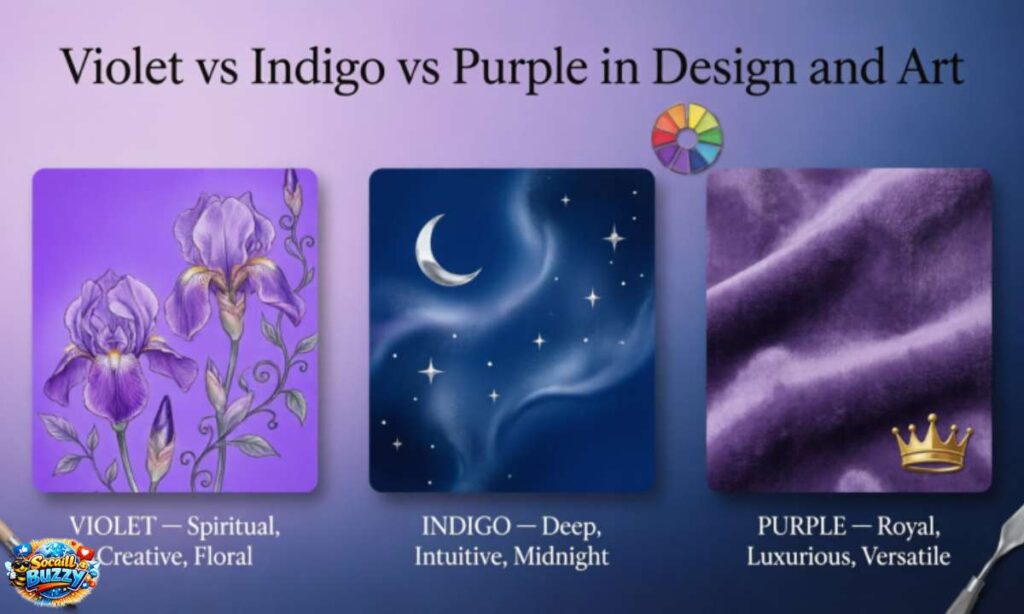
Violet vs Indigo vs Purple in Design and Art
Knowing which color to use in a practical context matters more than most people realize.
Use violet when you want something energetic, futuristic, or spiritual. It is vivid and electric. Tech brands and wellness companies love it because it feels innovative yet calming.
Use indigo when you want depth, sophistication, and trust. It pairs beautifully with gold and cream. Fashion, finance, and luxury brands reach for indigo when they want to feel established and premium without being a corporate navy.
Use purple when you want to communicate royalty, creativity, or luxury in the most universally recognized way. It is the most “readable” of the three as a symbol of distinction. When in doubt about which purple-family color to use, purple is the safe, powerful choice.
In printing, these differences matter even more. Ask your printer for “violet” and expect a specific CMYK mix. Ask for “purple” and you will get something noticeably warmer. Getting this wrong in branded materials is an expensive mistake.
Which One Should You Use?
Here is a quick decision guide so you never have to guess:
Choose violet if:
- You want a cool, electric, blue-leaning hue
- You are working in a spiritual, wellness, or tech context
- You want something that feels fresh and slightly unexpected
Choose indigo if:
- You want deep, rich color with blue undertones
- You need to communicate trust, heritage, or sophistication
- You are working with denim, nautical, or luxury aesthetics
Choose purple if:
- You want the classic “royal” feel most audiences immediately recognize
- You are working with creativity, fantasy, or imagination themes
- You want a balanced, warm-cool color with broad visual appeal
When you are working digitally, always specify your exact hex code. “Purple” means different things to different software, monitors, and printers. Locking in your specific value keeps your color consistent across every medium.
How Your Eyes Actually See These Colors
Your eye contains three types of cone cells, each sensitive to different wavelengths: red, green, and blue. Violet stimulates your blue cones strongly and your red cones very slightly. That small red-cone signal is what makes violet feel different from pure blue.
Indigo stimulates your blue cones almost exclusively, which is why it reads as so dark and blue-dominant to most people.
Purple triggers your red cones and blue cones simultaneously, with little green cone stimulation. Your brain interprets that combination as purple. No single wavelength of light does this. It is entirely a cognitive event, which is genuinely remarkable when you think about it.
This also explains why purple appears to “glow” differently than violet or indigo in certain lighting conditions. Your brain is working harder to process it.
A Quick Note on Lavender, Mauve, and Plum
Since we are in this neighborhood anyway, a few nearby colors worth knowing:
- Lavender is a pale, desaturated violet. Soft, floral, and light.
- Mauve is a dusty, grayed-out purple. Vintage and muted in feel.
- Plum is a very dark, red-heavy purple. Rich and almost burgundy at times.
None of these are violet, indigo, or purple in the strict sense, but they all live in the same color family and often cause similar confusion.
Click Here to Read Become vs Became
Frequently Asked Questions
Is indigo just dark purple?
No. Indigo is a distinct spectral color with its own wavelength on the visible light spectrum. It leans far more toward blue than purple and is significantly darker than most people expect. Calling it dark purple is a common but inaccurate shortcut.
Why is purple not in the rainbow?
Because purple does not correspond to a single wavelength of light. A rainbow displays the full visible spectrum in order of wavelength. Purple only exists when your brain blends red and blue signals together. Since red and blue wavelengths are at opposite ends of the spectrum and never appear together in a rainbow’s sequential band, purple never shows up.
What is the difference between violet and purple in everyday life?
Violet has a cool, blue-leaning quality and a slightly electric appearance. Purple is warmer, balanced between red and blue, and is the more familiar “classic” hue most people think of when they hear the word. In everyday settings, violet looks cooler and more vivid, while purple looks richer and more traditional.
Conclusion
Violet, indigo, and purple are three genuinely different colors with different origins, different physics, and different practical applications. Violet and indigo are real wavelengths of light you can find in a rainbow. Purple is a perception your brain creates by mixing red and blue signals, and it is nowhere to be found in the natural spectrum.
Once you know that violet leans cool and blue, indigo goes deep and dark, and purple lives in the warm middle ground, the confusion disappears. You’ll start seeing these distinctions everywhere, in design, in nature, in the liturgical robes at a church service, and yes, in every rainbow you’ll ever see again.
Now you’ll look at that rainbow and think: “Violet. Indigo. Definitely no purple.” And you will be right.

Welcome to SocaillBuzzy! I’m the creator and writer behind this platform, dedicated to sharing meaningful content including grammar, meaning, quotes, and inspirational messages for everyday life. Through well-crafted, SEO-friendly content, I aim to spread positivity, strengthen connections, and make it easier for readers to express their emotions with clarity and warmth.